Autism Awareness is Australia’s leading voice for autism, and they aim to improve the lives of all Australians on the autism spectrum and the families who love them.
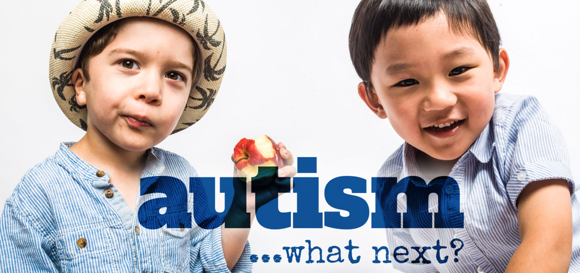
The Brief #1 | Branding for information pack: Autism...what next?
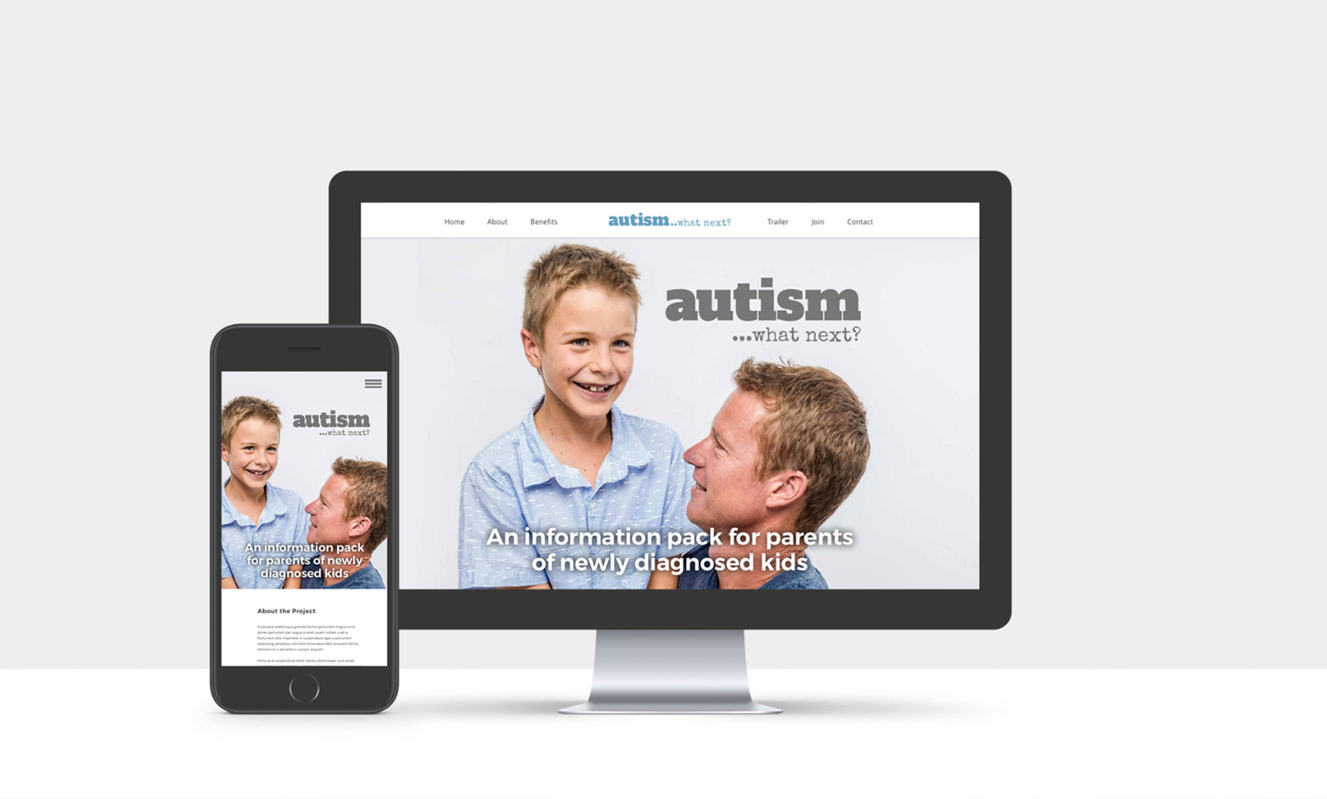
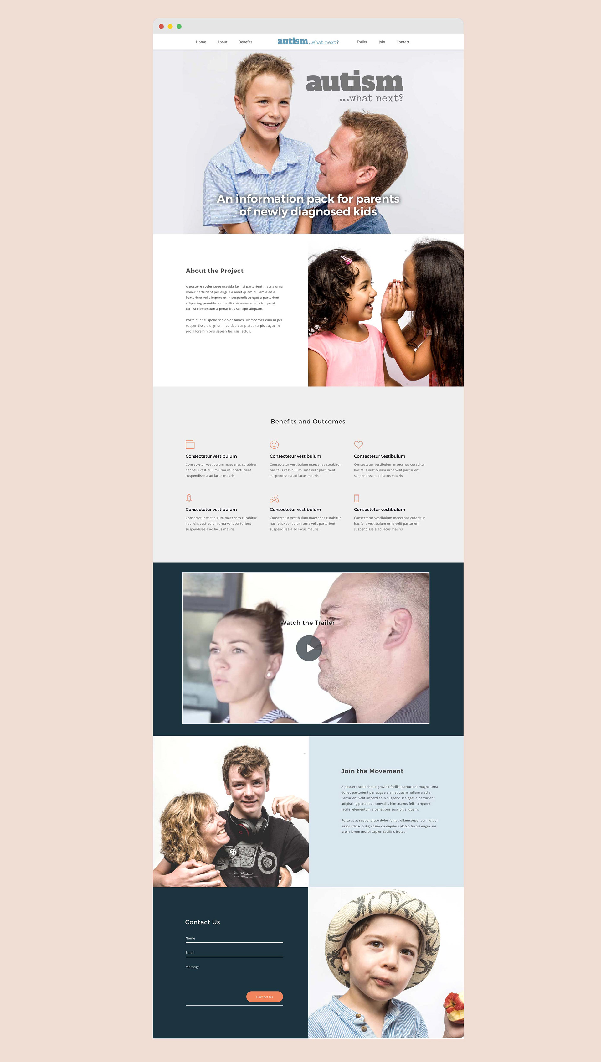
The AAA team identified the need to create an resource pack for parents of newly diagnosed children to help them navigate the range of questions they have and emotions they feel when faced with the initial realisation of having a child on the autism spectrum.
This brief required branding and a landing page for an upcoming promo video (featuring parents in the AAA community) to encourage fundraising for the project as a whole.
This brief required branding and a landing page for an upcoming promo video (featuring parents in the AAA community) to encourage fundraising for the project as a whole.
________________
The Result
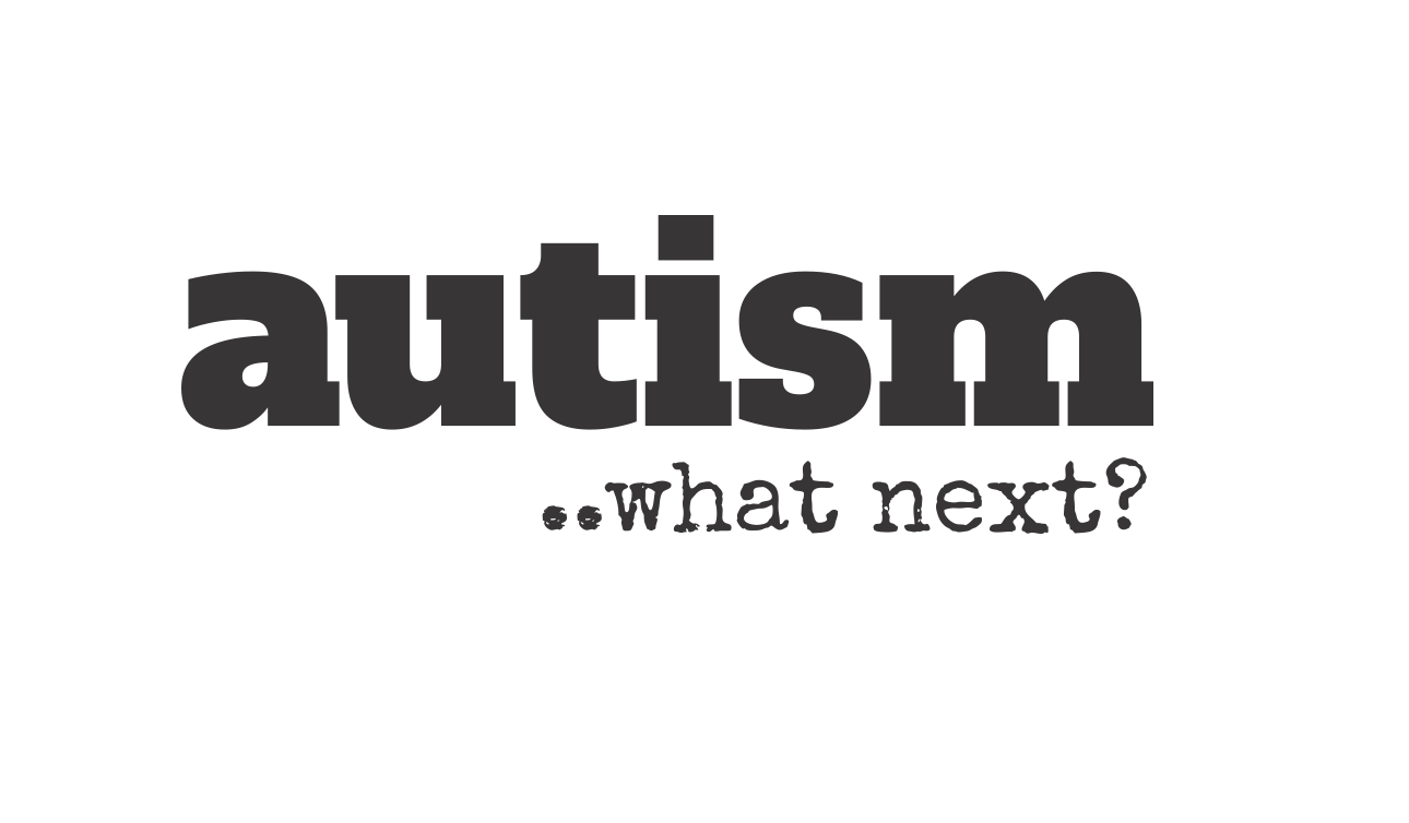
With two factors of diagnosis in mind (serious with solutions), I wanted to use a strong and bold font as the main header to convey seriousness, but pair it with a more conversational font to ask the question (almost with trepidation) “what next?” prompting the forthcoming solution.
The project is in it's infancy and, as with many not-for-profit projects, is awaiting funding for further development.
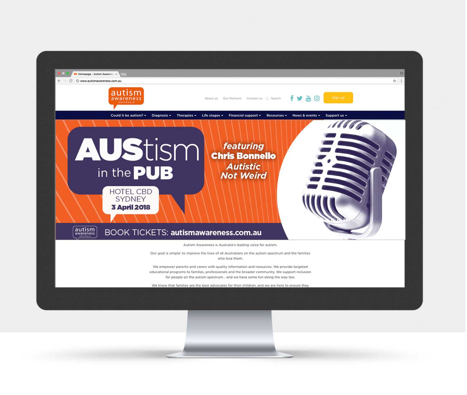
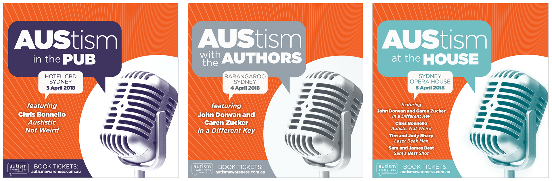
The Brief #2 | AUStism event branding
AAA hosted a series of three TED style talks aimed at individuals with autism and their families along with people who work within the field of developmental delays. The brief required branding for the event as a whole that could rollout across three different venues, along with assets across the digital spectrum.
________________
The Result
As it was a speaker type of event, imagery seemed obvious. I used colour to differentiate between the three venues, keeping within the brand colour palette for AAA, using their primary orange as the base.
The event was a huge success, and the AAA team have asked me to design for this years event.
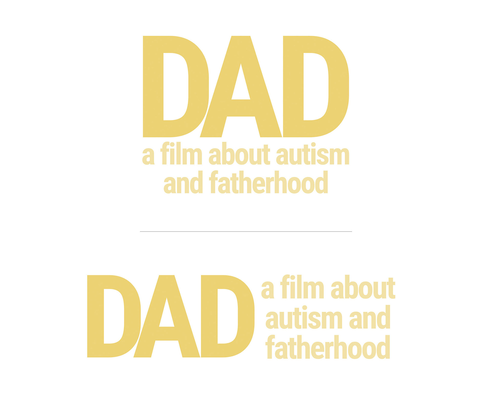
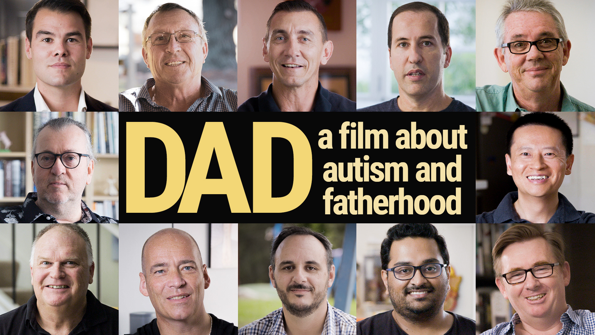
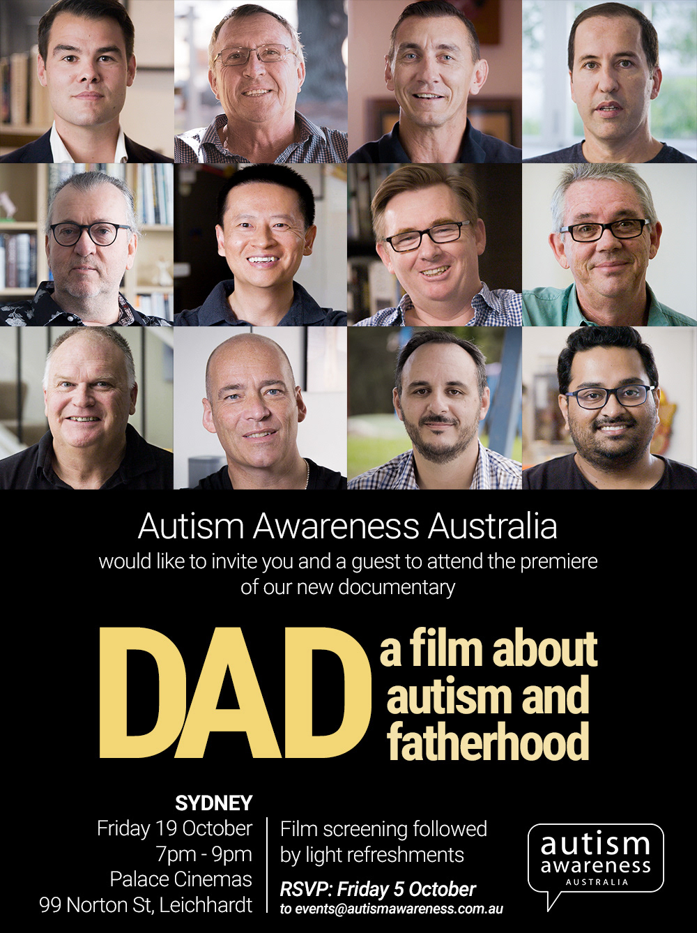
The Brief #3 | DAD: a film about fatherhood and autism
DAD is a documentary created to provide guidance, information, and support to fathers with children on the autism spectrum. The film shares the stories of twelve Aussie fathers as they discover a whole new world of parenting and what it means to be a dad.
This brief required branding for the film along with numerous collateral with rollout of assets across the digital spectrum.
This brief required branding for the film along with numerous collateral with rollout of assets across the digital spectrum.
________________
The Result
We all felt it was important for all twelve dads to be represented in the key art and in all promo material for this film. I used a simple Roboto text title treatment design: DAD in capitals for emphasis, all lower case for the supporting text.
It's tough subject matter, but extremely valuable to those who can identify with these amazing dads.